Design Story #01
Design Story: HeartGuide
Challenge to produce a wearable design to realize going for zero (zero cerebro-cardiovascular events)
Design Story #01
Design Story: HeartGuide
Challenge to produce a wearable design to realize going for zero (zero cerebro-cardiovascular events)
OMRON Healthcare’s design philosophy, Design for a Healthier Heart, is embodied in every product and project.
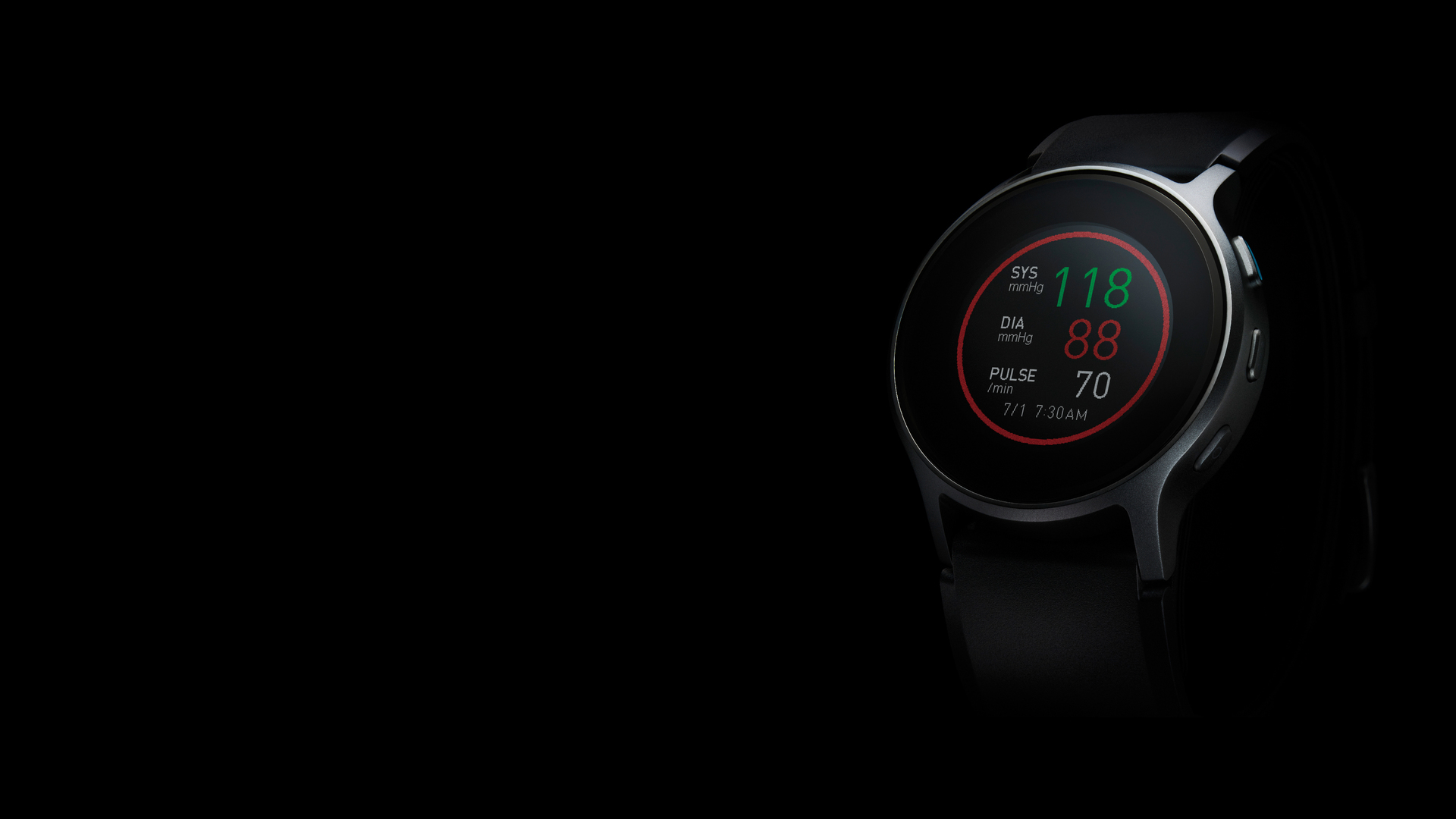
One example of such a design story is HeartGuide, which was developed with the goal of “Going for Zero,” meaning that an individual would have no cerebro-cardiovascular events at all.
Tsuyoshi Ogihara, design director of the Design Centre, Brian Brigham, in charge of user experience (UX), Takahiro Hamaguchi, in charge of user interface (UI) and Yoshikazu Goto, in charge of visual communication, joined the conversation.
History
Hypertension poses a serious risk
Heart disease and cerebro-cardiovascular disease is the second most prevalent cause of death in Japan.
The primary factor is hypertension, or high blood pressure¹. In Japan, approximately 43 million² people are hypertensive, of which 1 in 3 face severe risks in their everyday lives. Estimates suggest that 1 in 3 adults worldwide (approx. 1 billion people³) have hypertension, so controlling this condition is now a challenge at the global level.
Pioneering home blood pressure measurement
OMRON Healthcare released its first home blood pressure monitor in 1973, after almost 10 years of development.
At the time, people believed that blood pressure could be measured only at hospitals. Since then, OMRON has remained at the forefront of monitoring blood pressure at home, conveying its importance to a global audience.
Stepping up to the challenge
The problem, however, has not been eliminated. Cerebro-cardiovascular disease still decreases quality of life and remains a cause of death.
In response, we have taken up the challenge to explore ways to catch risky fluctuations of blood pressure by increasing the frequency of blood pressure monitoring, enabling us to predict the risks of cerebro-cardiovascular disease and prevent the onset of disease.
OMRON Healthcare launched HeartGuide, the world’s first wearable blood pressure monitor, in 2019.
It enabled people to monitor their blood pressure wherever and whenever they want. It also helps us to understand the daytime blood pressure fluctuation and to get better control of blood pressure. This is a great step toward solving the global challenge.
Establishing habits of regular monitoring
With the help of doctors, we have accumulated clinical evidence supporting the efficacy of home blood pressure monitors and established the habits of monitoring blood pressure twice a day.
Looking into the future
To advance this culture forward, in the next phase we plan to initiate preventative treatments of hypertension.
1 Demographic statistics from the Ministry of Health, Labor and Welfare in 2010.
2 Epidemiology of Hypertension in Japan – Where Are We Now? (2010) – Katsuyuki Miura, MD, PhD; Masato Nagai, PhD; Takayoshi Ohkubo, MD, PhD
3 WHO report, 2013
Role of design in “Going for Zero”
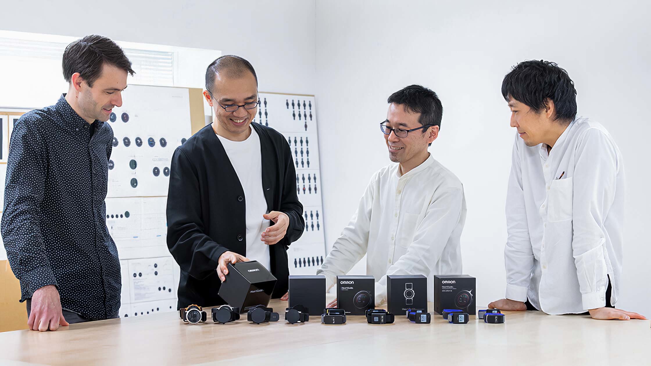
From left to right: Brigham (UX design), Ogihara (design director), Hamaguchi (UI design) and Goto (visual communication)
Ogihara: It may be about blood pressure management difficulties that people encounter during daily health control and medication managements were not well understood.
Our first step as a design team is to understand the demographic of patients, how they feel and how they live with their conditions.
We must spot small but significant ailments and anxieties in their daily lives and consider the best solution using cutting-edge technologies. This is one of the design team’s most important roles.
Hypertension prevalence increases with age, so more frequent BP monitoring is required.
Advances in science and technology drive the evolution of smartphone apps. Today more elderly people than I expected are using smartphones for their BP management and health control. We need to understand the quick evolution of environments and user behaviours and incorporate their needs into our products and services. I believe this is where we can contribute to the goal of Going for Zero.
Hamaguchi: “Going for Zero” is a business vision with technologies to make it happen. While we were trying to find a balanced solution, we established the UX-first approach, which prioritizes the user experience and values good communication with users.
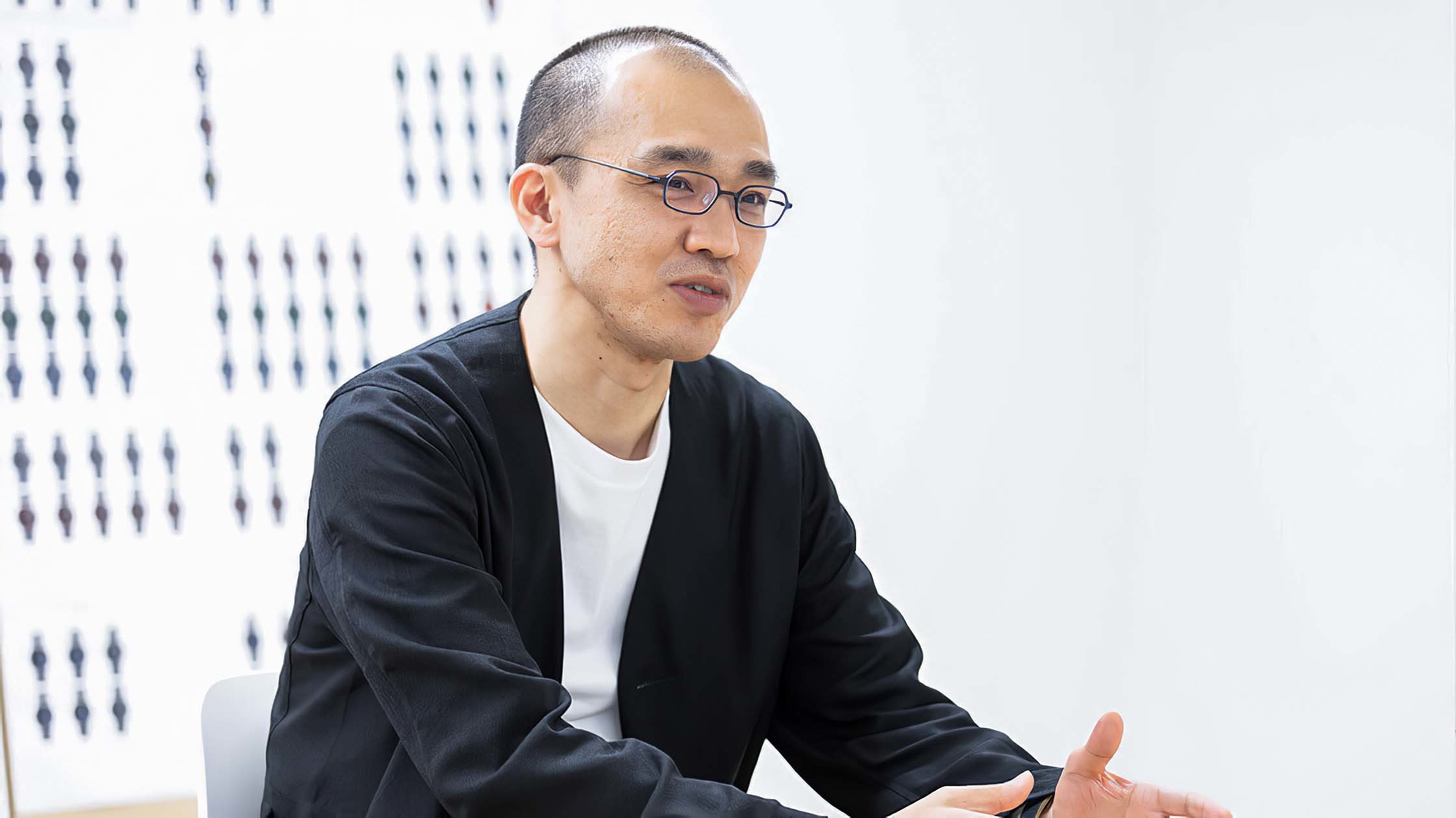
Ogihara-san
Ogihara and his team have been working toward the mission of “Going for Zero” since 2015, starting the development of super-micro blood pressure monitoring, while maintaining the high level of accuracy. Considering the UX-first approach, the concept evolved gradually.
Ogihara: The Design Centre, which I now belong to, started as a hardware design team. Now, we focus on better user experiences for the visions and technologies of OMRON Healthcare. So we now handle a wider variety of products and services including hardware, UI and smartphone apps.
It is important to clarify our visual and verbal messages when considering delivering our vision to users.
For example, conceptual business visions should be clearly defined when they are communicated visually. This is why Goto, who is in charge of visual communication, joined the project at an early stage and worked with us in visualizing the concept of the product. We wished to define the business vision by embodying it into the products.
Goto: My main role in the team was to think how to communicate the appeal of the product effectively. This is not only about making the visual appearance nice and beautiful. We to add the design perspectives in the development process.
Brigham: My role is to make sense of the business strategy and the technology and determine whether the consumer actually wants it or can use it.
I think design has always been about the user.
That’s what UX is. In order to do that, you have to start from the beginning, UX first. So particularly with this project, I actually wanted to go for more than just an industrial design.
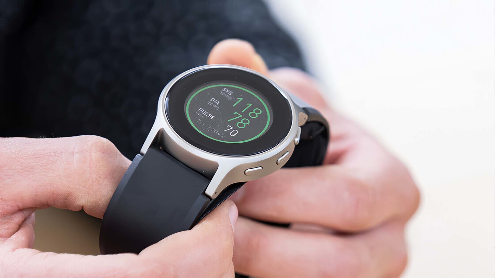
Wearable blood pressure monitors enable people to measure their BP wherever they are, whenever they want. Blood pressure fluctuates constantly throughout the day, and everyone has their individual trends. HeartGuide gives you an accurate understanding of your own daytime trend of blood pressure fluctuation.
Backstory
Backstory of the development of HeartGuide: project management and user survey
Brigham: HeartGuide is one of the first projects where we had engineers and design working together from the very beginning. It took 3 or 4 years. It was 2015.
We tested this early on by making rough prototypes and doing actual user testing on the people in the US.
We learned people can’t find their artery. Actually, they don't even know what it is.
Only about half could reliably place the sensor over the artery. When we began developing the HeartGuide technology, we thought it would be necessary to measure the BP by aligning the sensor with the artery. That’s why the user testing was good for us. Obviously we were wrong.
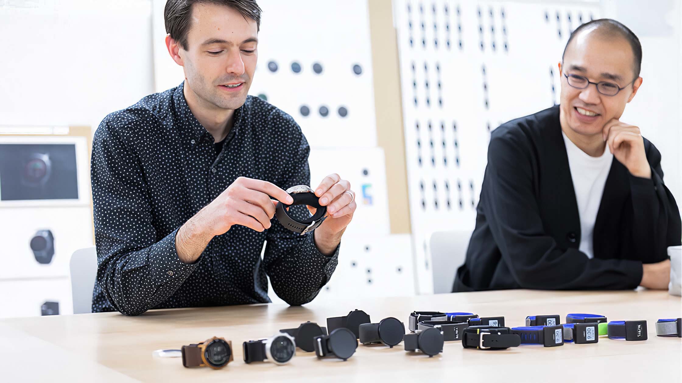
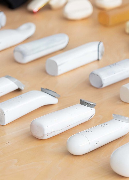
Brian holding some prototypes in his hands
Ogihara: At first, we thought we would be able to reduce the size of the device easily when people found their artery and fit the sensor on it. However, the survey in the US showed our hypothesis was wrong. So we shifted our focus and in collaboration with the R&D team, we sought to make it much easier to use.
For this, we needed to explore not only comfort and wearability, but also maintain the high level of measurement accuracy. This is one of the hallmarks of our business, and we repeatedly developed prototypes with usability and accuracy in mind. Collaboration between engineers and designers operated smoothly and helped the rapid progress of the project. While Brigham carried out multiple user surveys in the US and shared the results with us, R&D responded. As I said, this is the first project where designers and R&D team worked together from scratch. It was a great opportunity to work hard and encourage each other to clear the hurdles.
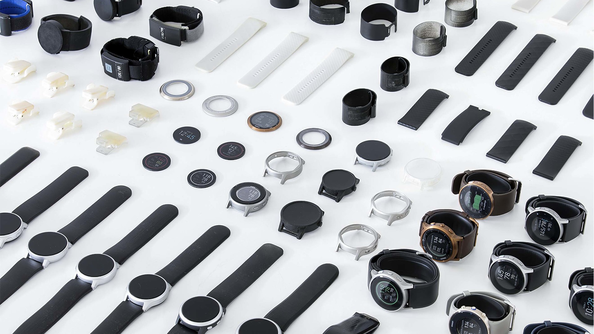
Brigham: We changed the size of the sensor in response to the user research.
This is maybe the first example. But we went through many many iterations.
It turns out that in order to completely cuff the compress at the wrist, we need to have the cuff all the way around.
We had to make a variety of changes to the cuff design itself, and how that impacted the placement of how people put it on.
The other part of that is what people are willing to wear. That’s where more of the image of the blood pressure monitor is. Early on, we weren’t thinking of a watch. But, through user research, visiting people’s homes and talking to them, we learned that they really didn’t want to call attention to any sort of device on the wrist.
We also picked a watch because it gave engineering a limit on size. Size is really important. At that time, smart watches were about this size. So we could give engineering a really concise goal for how big to make it.
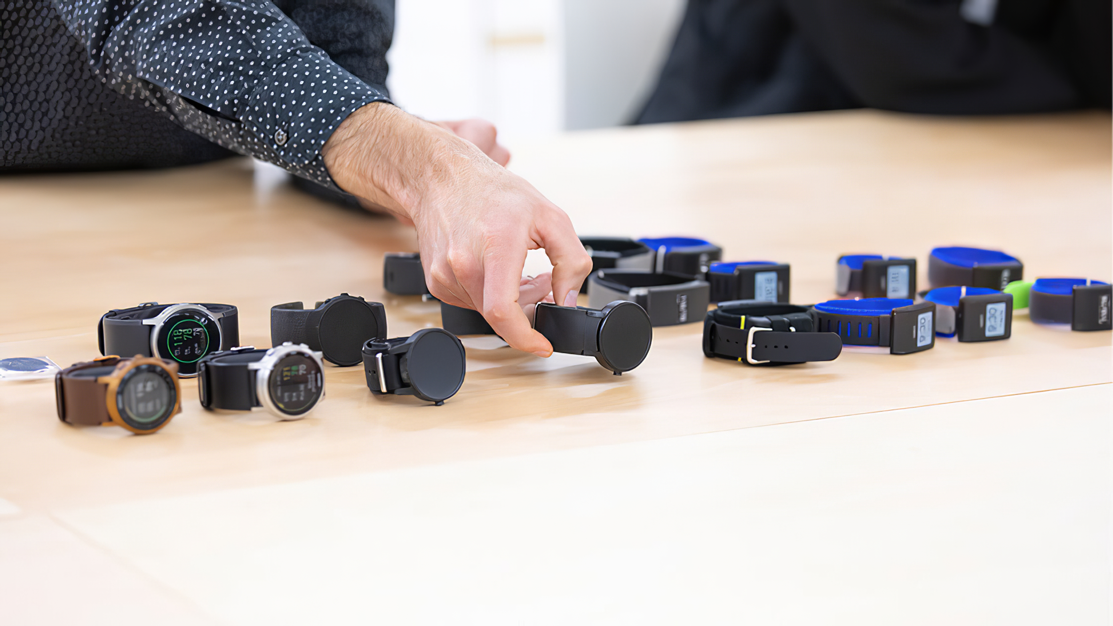
HeartGuide prototypes
What were the biggest insights you gained during user surveys?
Brigham: Probably, my biggest learning from the research is, depending on your target, they are definitely people who are much more proactive and interested in knowing themselves. That’s ultimately who we targeted as our target market. We call them “take control.” This is a name of the persona we have given them.
They take their own initiatives to solve problems and to understand their blood pressure.
What kind of challenges did you face during the development of the very first watch-type blood pressure monitor?
Hamaguchi: This is a completely new device. Everyone who got involved in this project had their own individual vision. For example, someone wished to incorporate a function to receive messages, or add a function of a pedometer. Another wanted to add a function to measure the quality of sleep, and another wanted a history of blood pressure readings.
However, we needed to focus on a balance between display and CPU function during the design process because monitoring blood pressure itself requires an advanced level of control.
One of the most challenging tasks was to make choices within constraints, and limit the functions for smartphone apps.
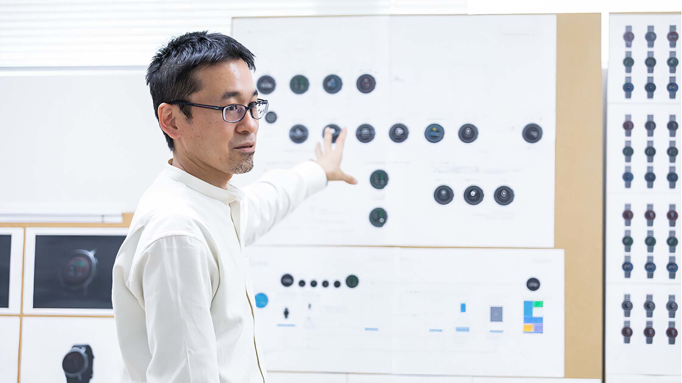
Hamaguchi-san
Hamaguchi and team members had repeated discussions to strike a happy medium.
During the discussions, we often used a flow chart which shows functions and screen transitions. The main purpose of this project is to increase the frequency of BP monitoring, and the concept of HeartGuide was “anytime, anywhere”. So we put these taglines on a wall and refined the chart in order to align the awareness of everyone who got involved in this project. This allowed us to repeatedly consider why this shape is necessary and why this function is essential.
What point did you consider the most while contemplating the main target users?
Hamaguchi: While studying the results of user surveys, we found out there are typical methods or operational orders for older users.
People appreciated simplicity and user-friendliness more than we expected, and so we decided to focus on the function to monitor blood pressure and removed non-core functions.
At the same time, we developed app functions to help the user understand trends and analyse their readings.
We were able to clarify the positioning of HeartGuide, a device to increase the frequency of blood pressure measurement. At the same time, we started to think about the user experience from the initial opening of the box, to establishing the initial settings of the app, all the way through to how the measurement data is used.
As the one in charge of visual communication, which part did you focus on the most?
Goto: What I focused on the most was the UX-first approach. As HeartGuide is the very first device of this type in the world, we needed to think carefully how to reach users and how to get their approval, or what type of experience we are able to offer to those who liked the product. We then focused our marketing efforts using effective communication.
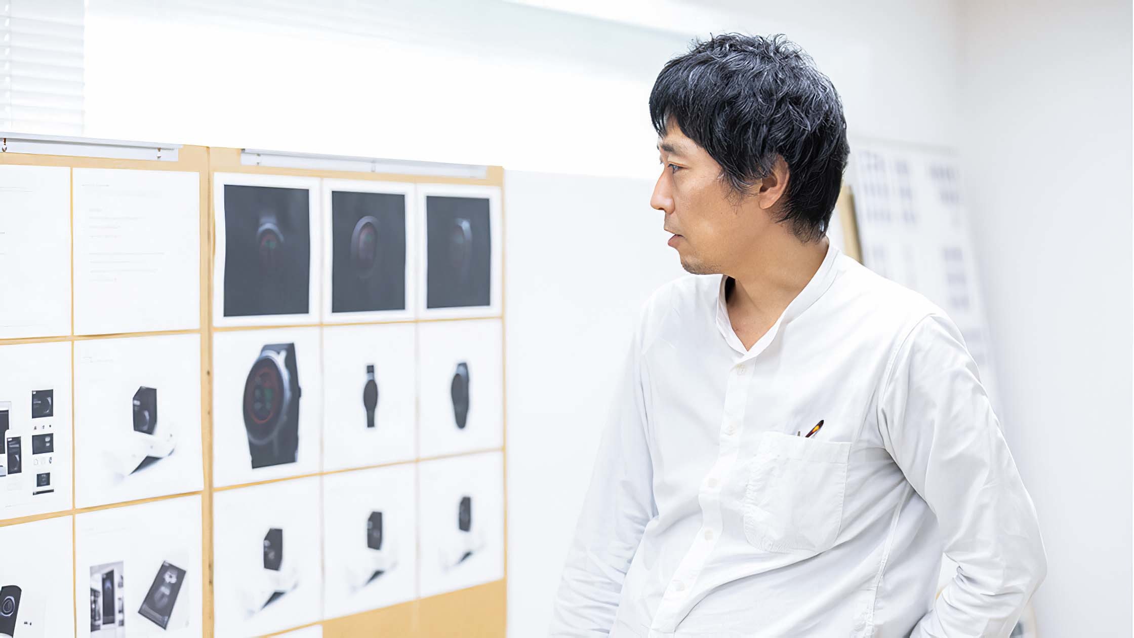
Goto-san
First determine the concept, core values and main target of the device, then narrow down the communication methods both visually and verbally.
Visual and verbal communication of the product should be memorable once it is on the market. In branding, this is called brand equity.
In order to help users understand our brand, we formatted colours, fonts and key visuals specifically for ease of use.
In addition, HeartGuide is one of the flagship blood pressure monitors to represent our Going for Zero vision. We shared the concepts, core values and target markets with our global members to establish the one brand.
The key visuals being clearly differentiated from the conventional images of blood pressure monitors.
From a manufacturer of medical devices to a health provider
What is the next step for achieving the Going for Zero vision, to have no cardiovascular events?
Hamaguchi: First, we are now trying to expand our business domains from blood pressure management to the prevention of cerebro-cardiovascular diseases. We have started the development of a technology to detect atrial fibrillation (one of the symptoms of an irregular pulse).
Atrial fibrillation leads to blood clots within the heart, which can lead to cerebral infarction.
As part of a global initiative, we have started the VitalSight project in the US, a remote patient monitoring service with the aim of achieving zero events, the purpose of the Going for Zero mission.
In order to prevent the onset of events, it is critical to quickly respond to any abnormality in blood pressure.
Daily monitoring provides vital data for effective medical treatment based on doctor’s instructions. This is how we started the development of remote patient monitoring service. For effective hypertensive treatment, it is critical to continue the blood pressure management. For example, in Japan, patients are supposed to visit the doctor every three months and take medication every day. It often forms a barrier for patients to carry on their hypertensive treatments, and for doctors, it is also challenging to understand patients’ physical conditions during a check-up only every 3 months without examining the data taken at home.
If home blood pressure readings can be shared with doctors and healthcare professionals automatically, and when you are able to receive prescription drugs at home, then it will be possible to reduce the physical and financial burden of visiting the doctor and control blood pressure efficiently at the same time.
We will keep on developing and providing user-friendly devices and services for achieving Going for Zero by promoting home blood pressure monitoring.
Brigham: OMRON has expanded its businesses from device manufacturer to service provider, from monitoring blood pressure to managing cardiovascular diseases.
OMRON has been in business for 40 years making a device that only takes a measurement. That was the end point with the user. But now, we are collecting data.
So, what we have to do now is take all these measurements that they’re collecting and help interpret them. So that’s ultimately what remote patient monitoring (RPM) is. It is helping them make sense of the data that they’re collecting. There are different dimensions of RPM. It can be done from a doctor-centred standpoint, but there’s also a consumer side. So this is really just a starting point. It makes it easier to measure and easier to collect more data. But what we’re working on now is helping them take that data and make meaning from it. And take action based on that data.
Goto: We have expanded our business from blood pressure monitoring to new domains including electrocardiogram (ECC) readings.
The more complicated our business becomes, the more important it is to communicate with users in simple language.
In order to be competitive, I believe we need to establish our brand identity, to focus on simple messages and communicate effectively with users. To do this, we need to find our core competence and help users to make choices by delivering clear messages.
Ogihara: As we’ve said, in the past we only needed to focus on the users of our devices. Today when we think about the way to achieve the Going for Zero vision, the range of our stakeholders has expanded. Adding the communication with doctors, interaction with nurses and pharmacists could be one of the important UXs to users, and the touchpoints as well. We need to be highly conscious of the laws and medical systems of each country where we launch our products and services.
We are also required to understand users and healthcare professionals, and provide added value and positive experiences. I believe this is the true role of design in light of realizing the Going for Zero vision.
Thank you for subscribing!


